
Ritam Biswas
000
ZENO
ZENO
Smart EV Charging Management

How I Turned a Data-Heavy EV App Into a Four-Second Experience.

UX DESIGN
EV APP
CASE STUDY
Confidential Note

Zeno is a portfolio-safe recreation of a product I designed for a Copenhagen-based EV startup. With the company's permission, I rebuilt it under a new brand. Every decision, constraint, and insight here is real. Only the branding changed.

ZENO App
35+ High Fidelity Screens

Covers every key user flow from onboarding through dashboard, analytics, and account settings.

5 Complete User Flows

Onboarding, dashboard, charging session, analytics, and settings.

40+ Reusable Components

A full design system built using Figma variables and design tokens for UI consistency.

2 Month Design Sprint

Blank file to production-ready designs, shipped end to end in just 2 months.

What Zeno Does

Electricity prices change every hour. Most EV owners charge at the wrong one. Zeno's algorithm monitors real-time prices, finds the cheapest window before your departure, and charges your car then. You set two things: when you need to leave, and how full you want the battery. The app handles everything else.

Perspective

“You set the departure time. You set the target charge. The algorithm finds the cheapest hour and does the rest.”

My Role

Sole designer from day one. No existing product, no design system, no prior work to inherit. Only a vision from the CEO and CTO and a blank Figma file. What I know now about design systems, component thinking, and stakeholder communication came directly from the pressure of this project. Everything here was built from scratch.

The Problem

Insight

Make a product built around a smart algorithm and dense real-time data feel effortless for someone who just wants their car ready in the morning.

The dashboard had to surface a lot without overwhelming the user. Every item on screen needed a clear reason to be there.

Must Show
Why
Battery % + time remaining + ready-by
Core reason users open the app
Target State of Charge
The charge ceiling set by the user
Departure time
What the algorithm schedules around
Auto Mode, On/Off, Cable Lock
The three primary controls
Charger and vehicle selector
Context for multi-device users
Connection status
Confirms the system is live

Research and Early Thinking

Before designing a single screen, I audited the competitive landscape. Every existing EV app had the same three problems.

Built for engineers

Technical vocabulary with no softening. Everything assumed power-user knowledge.

Information overload

Every metric visible at once. No hierarchy, no breathing room. Overwhelming to scan.

Accessibility barrier

Older users hit a wall before trying a single feature. The learning curve was immediate.

These three patterns shaped one clear direction. The product needed to surface what mattered now and let everything else wait quietly until it was needed.
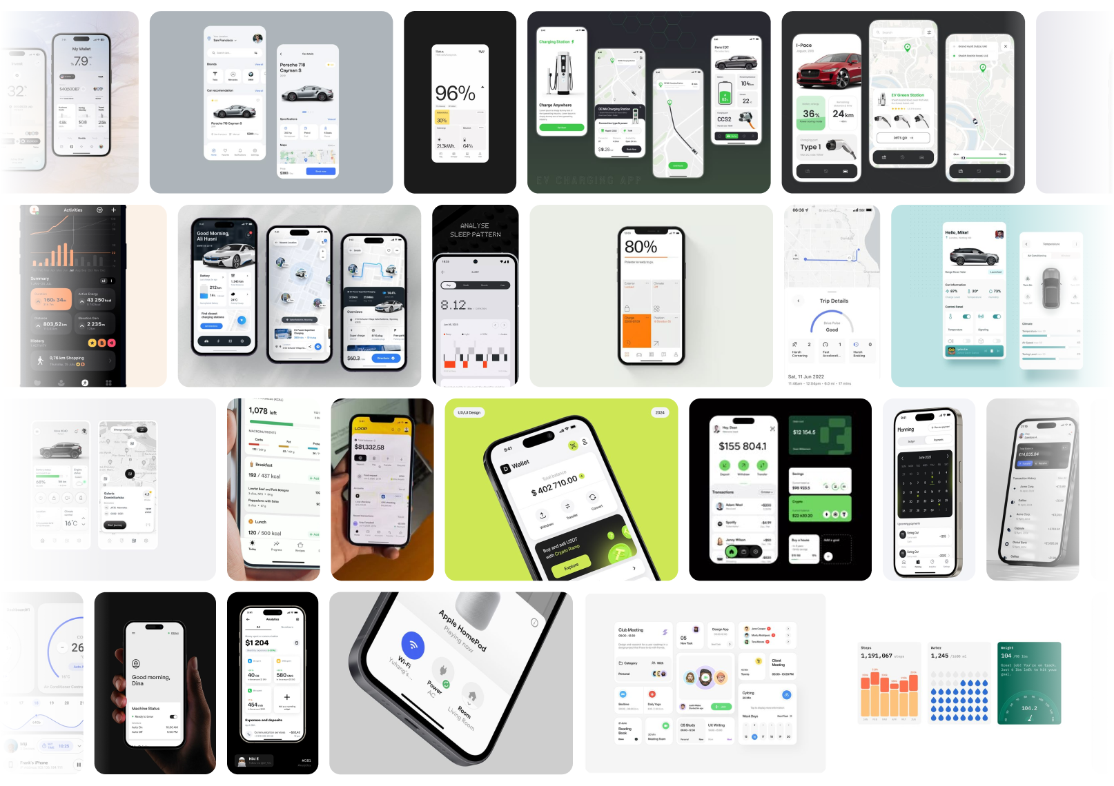
Design References
Perspective

“This product needed to feel like an assistant, not a control panel.”

Onboarding Flow

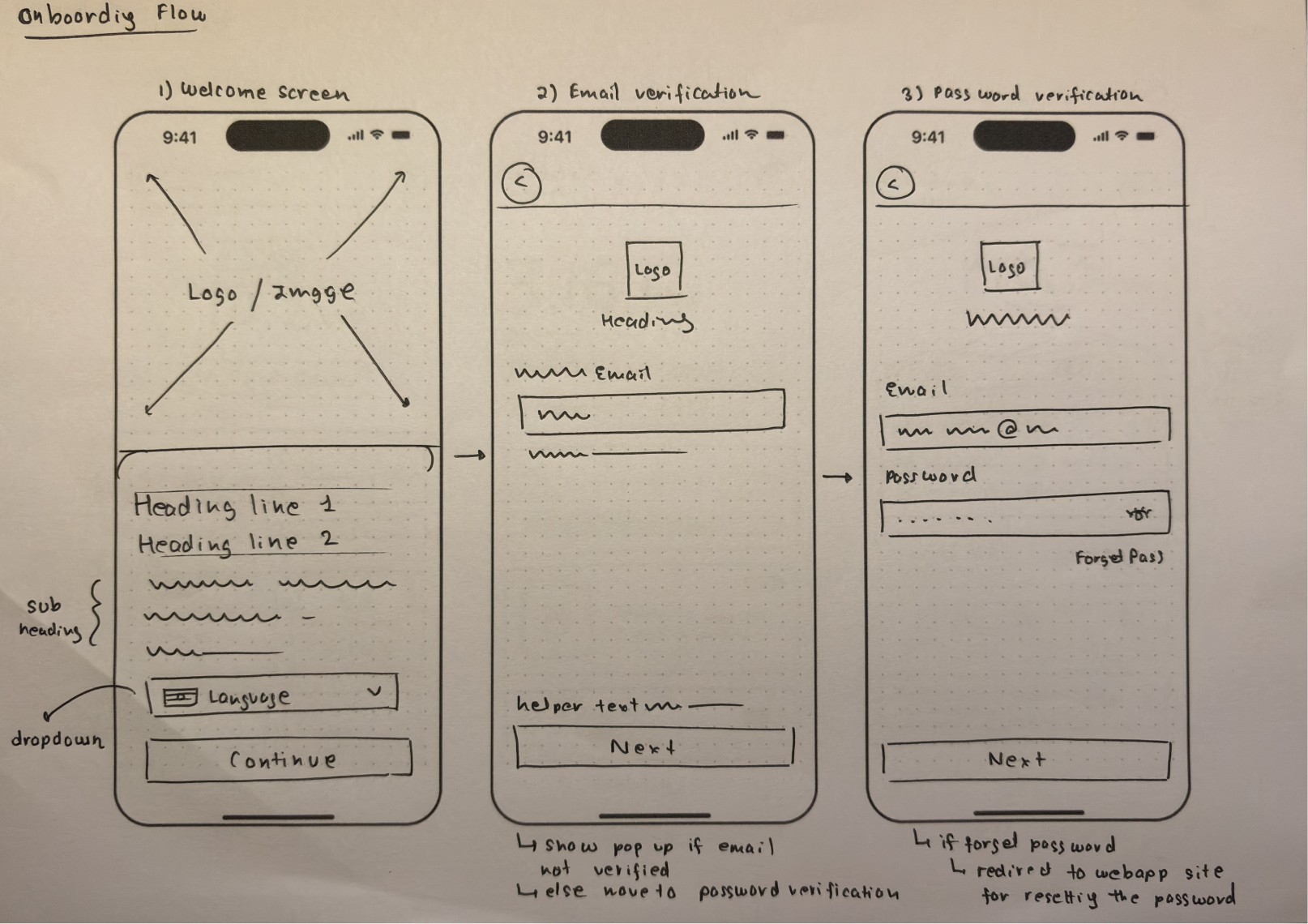
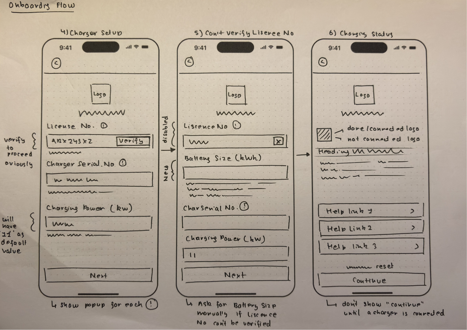
The onboarding needed to collect a lot from new users: email, password, charger license, serial number, battery size, and connection confirmation. One task per screen with clear conditional logic kept it from feeling heavy.
Insight

Six focused steps felt lighter than any single long form. Users always knew exactly what they were being asked to do.

Onboarding Wireframes
Onboarding Screens

Dashboard Exploration

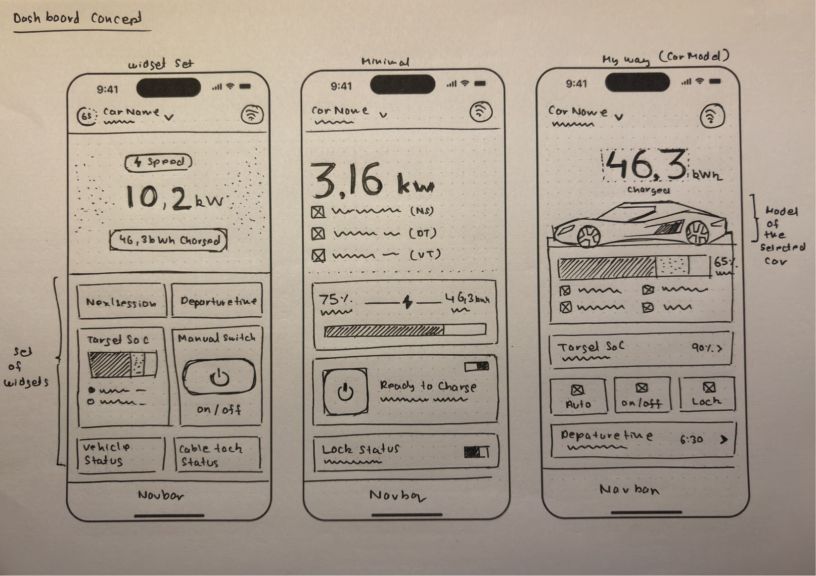
Three concepts were explored before landing on the final direction.
Concept Sketches
Widget Set
Minimal
My Way
Every metric in its own card.
Stripped back, text-heavy.
Vehicle image anchors the screen.
Felt like a cockpit.
Felt like a diagnostic report.
Felt personal and immediate.
Hard to scan at a glance.
Clean but emotionally cold.
Clear hierarchy from first sketch.
Insight

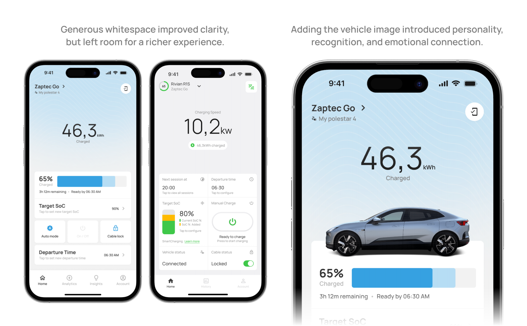
The vehicle image was not cosmetic. It told users immediately which car they were managing and made the experience feel personal rather than generic.

The Decision Journey

DECISION 01

From widgets to grouped components

Dashboard Comparison
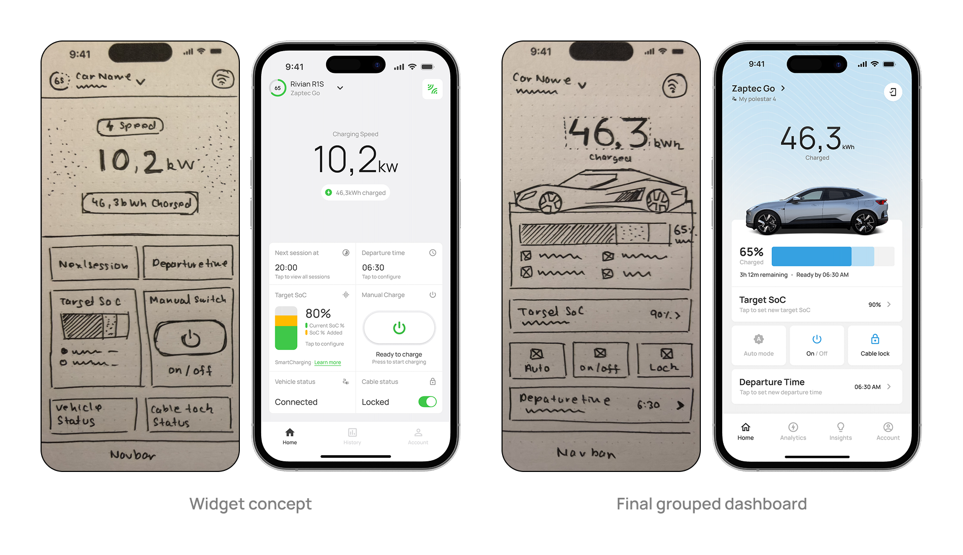
Widget Concept
Final Grouped Dashboard
Each metric isolated in its own card
Related data sharing one visual block
Controls scattered with no priority
Auto, On/Off, Lock in one unified row
Required active reading
Scannable in under two seconds
Lesson

Good design is often about deciding what not to show separately, not what to cut entirely.

DECISION 02

Defending white space

Stakeholders suggested reducing spacing around the charging indicator to fit more data. I pushed back with user reasoning, not preference. Older users reading a dense screen work harder to find what they need. White space was doing real usability work.

Resolution: Secondary controls moved to modals. White space stayed.

Lesson

"This looks cleaner" loses. "Here is what our user is doing at 7am" wins.

DECISION 03

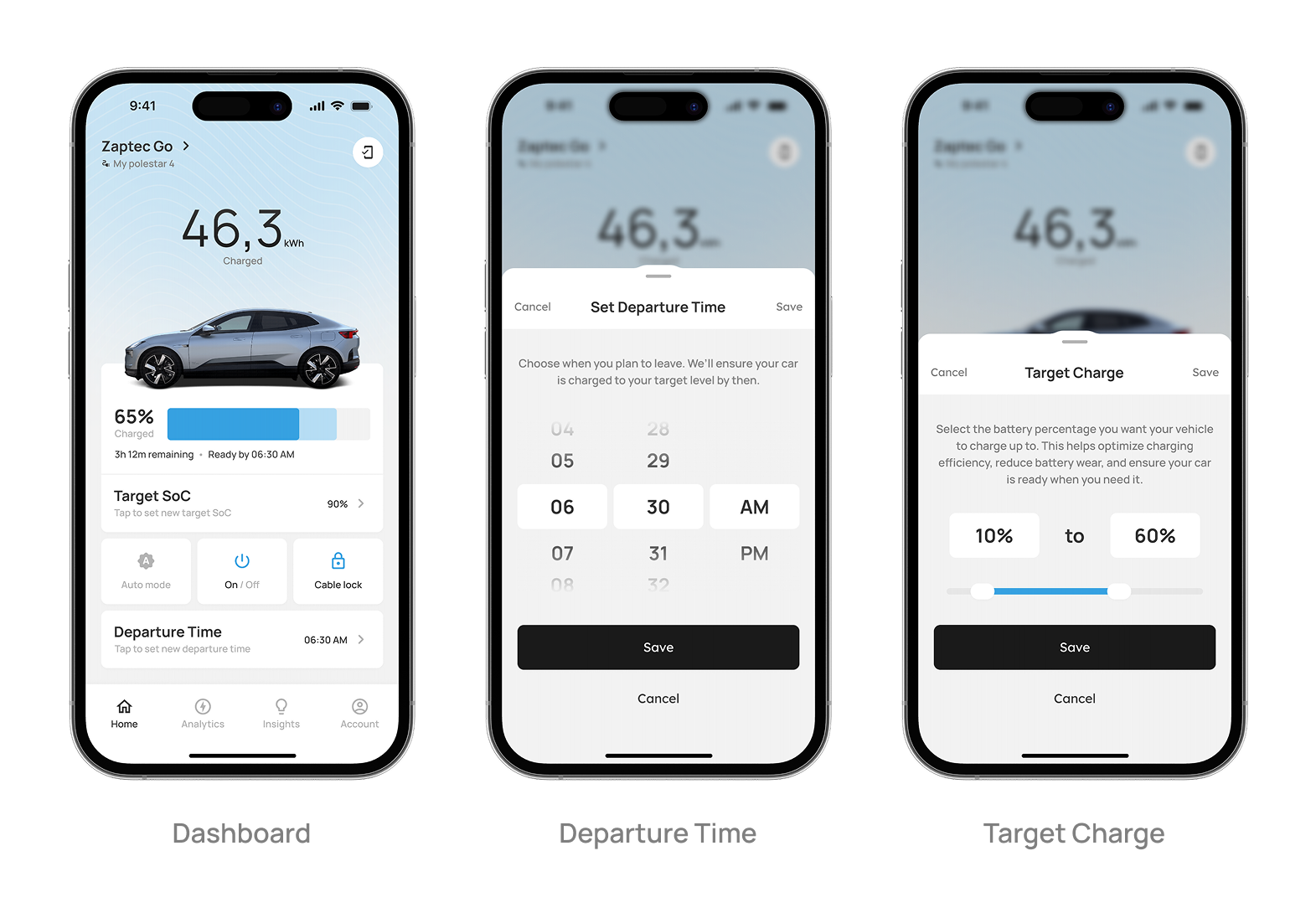
Target SoC and Departure Time hidden behind a tap
Interaction Detail
Problem with surface placement
Solution
Too much vertical space consumed
Compact row with chevron showing current value
Accidental touch risk while navigating
Full controls open in a modal on tap
Competed with primary charging info
Dashboard reserved for read-only data
Lesson

When a setting controls something important, accidental input justifies removing it from the main surface.

DECISION 04

The vehicle image

Vehicle Integration

The vehicle image was in the very first concept sketch, not a late addition. During design review, the CEO and I noticed how Tesla showed your actual car, not a generic icon. I proposed the same. Building it took time: vehicle APIs, custom assets, model cutouts. But the sketch shows I knew from the beginning this was the right direction.

Lesson

Sometimes the most impactful decision is not about layout. It is about making someone feel something about their product.

DECISION 05

What got cut, and where it went

Beta users opened the app, checked battery percentage, glanced at the ready-by time, and closed it. Four seconds. Everything else went unlooked at.

Stayed on Dashboard
Moved to Analytics
Moved to Settings
Battery %, time remaining, ready-by Auto, On/Off, Cable Lock
Cost savings, energy usage, session history
Connection status, vehicle management Account, language, security
Insight

A dashboard answers the most important question the user has right now. Everything else waits one tap away.

DECISION 06

The feature we built, shipped, and removed
Usage Analytics

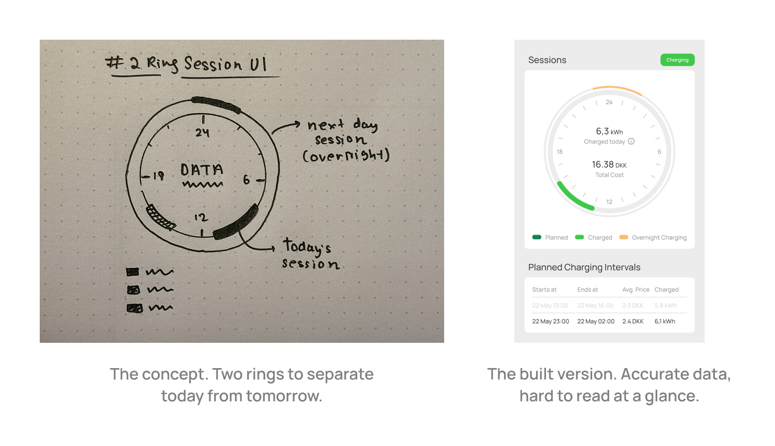
We designed a double-ring clock widget showing the algorithm's charging schedule. Inner ring for today, outer ring for the next day. Electricity price data in Denmark does not reset at midnight, so sessions could spill past 12am. The two rings solved that technically.

What we assumed
What users experienced
Two rings clearly separate today vs tomorrow
Confusing with no obvious starting point
Legend explains the color coding
Users did not read the legend first
Showing the schedule builds trust
Complexity made them question the algorithm

Beta users found it mentally taxing. The deeper problem was not the visual. It was the concept. The algorithm's job is to remove decisions from the user, not explain its own logic to them. We removed the feature entirely. Trust came back when the complexity disappeared.

Lesson

A feature that requires explanation has already failed. The best interface for a smart system is one that makes the system feel invisible.

The Final Product

35 screens across 5 core flows: onboarding, dashboard, charging session, analytics, and settings. Designed for iOS and Android.

One task per screen. Clear conditional logic at every step.
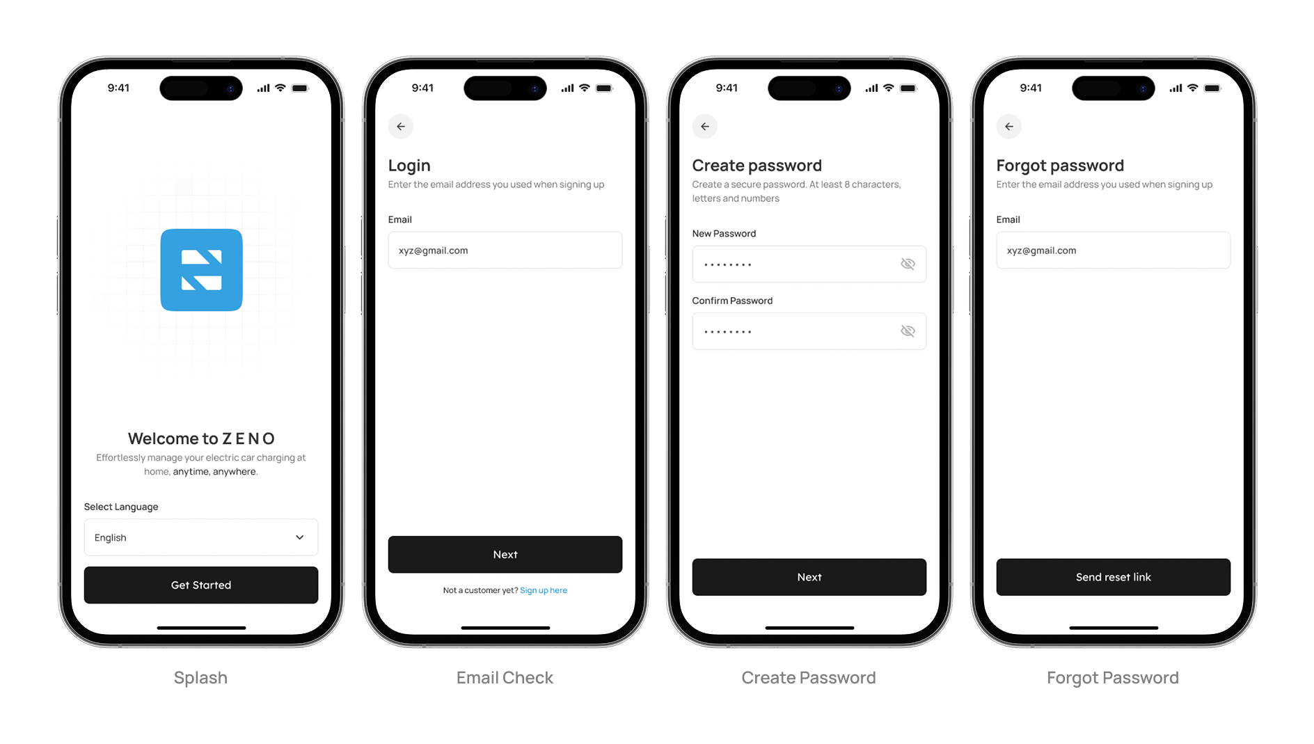
Onboarding

One screen. Everything visible immediately. No hunting, no scrolling.
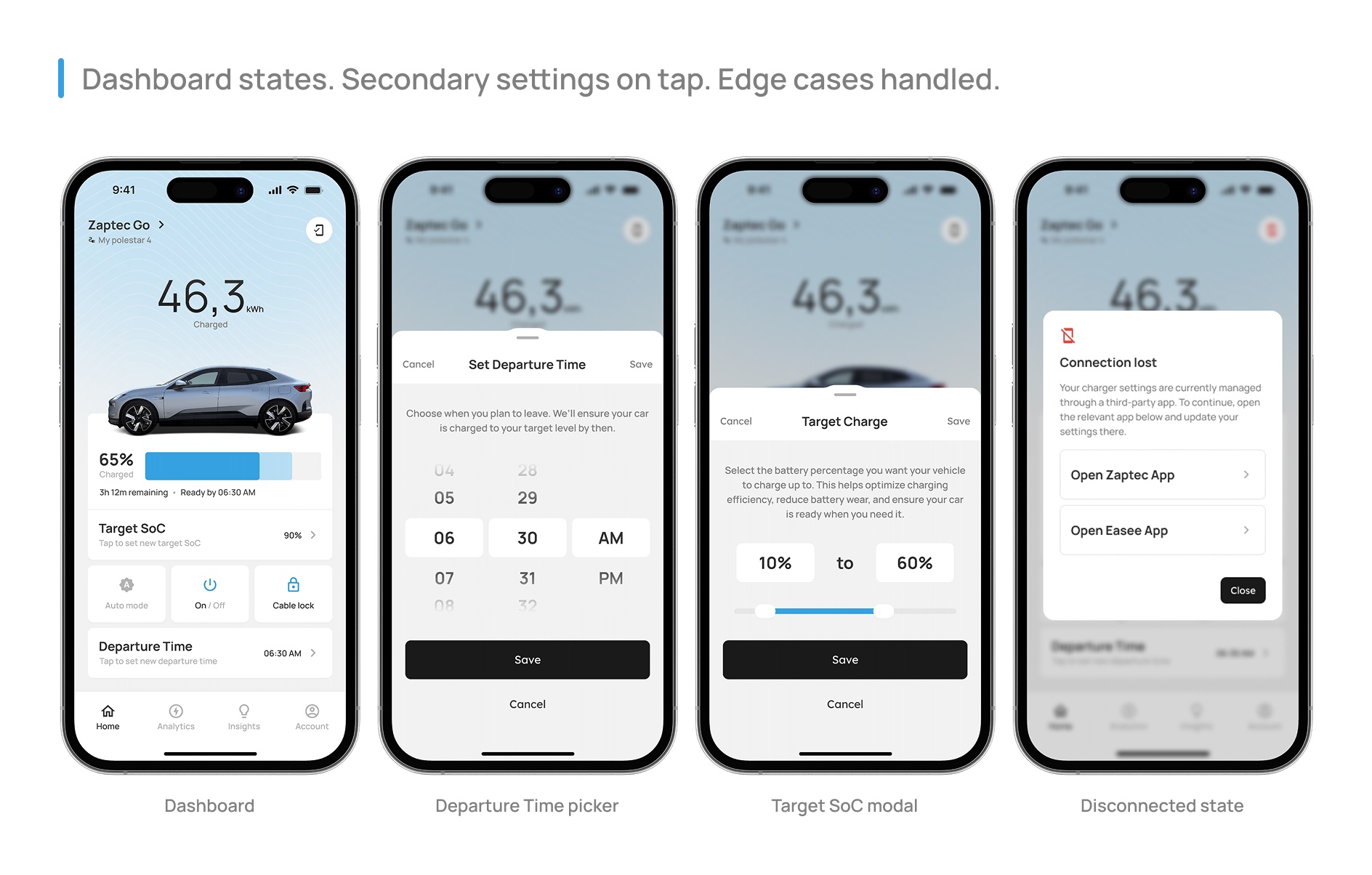
Dashboard

Everything removed from the dashboard lives here.
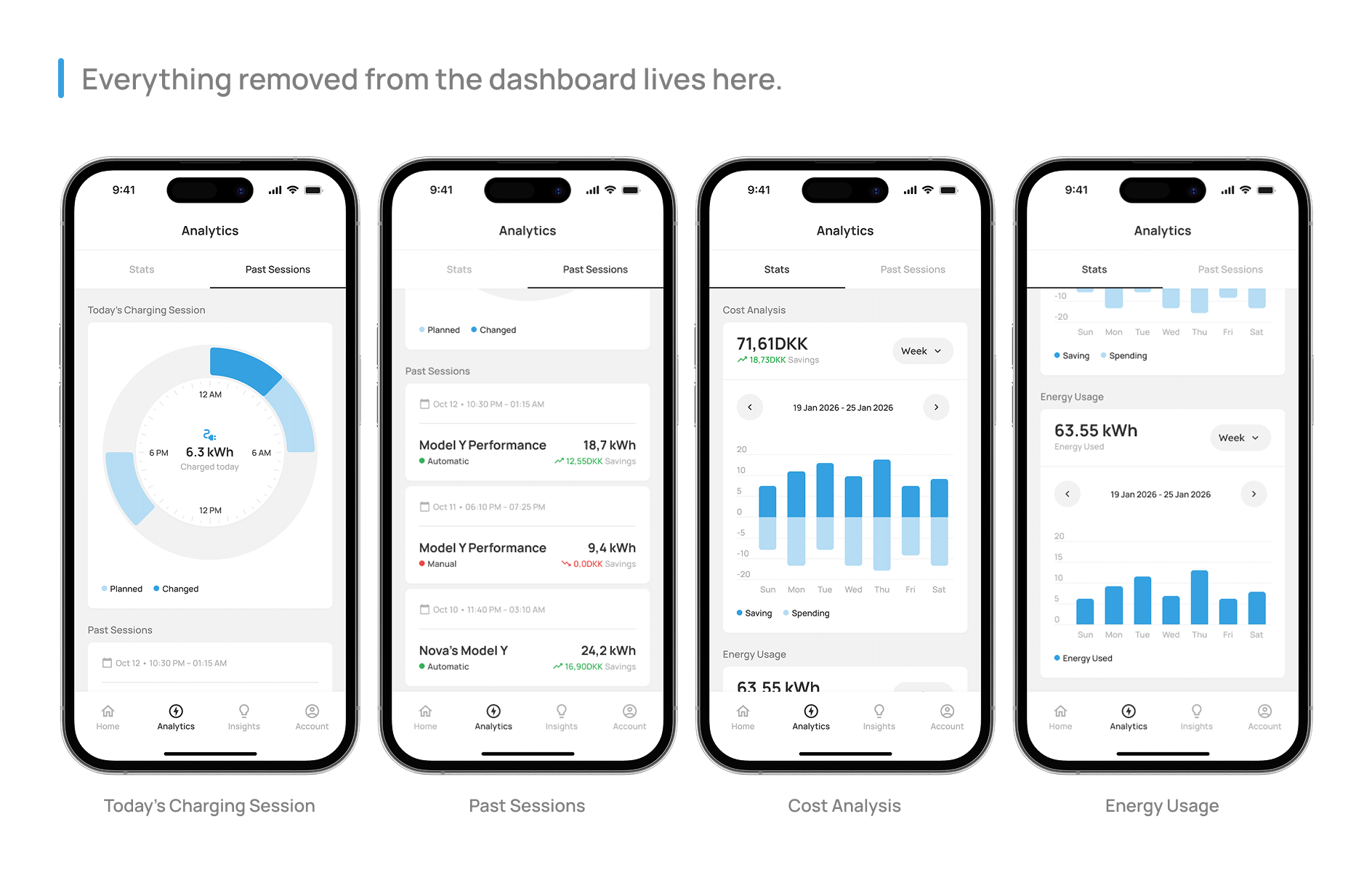
Analytics

Assembly rather than invention. The design system paid off here.
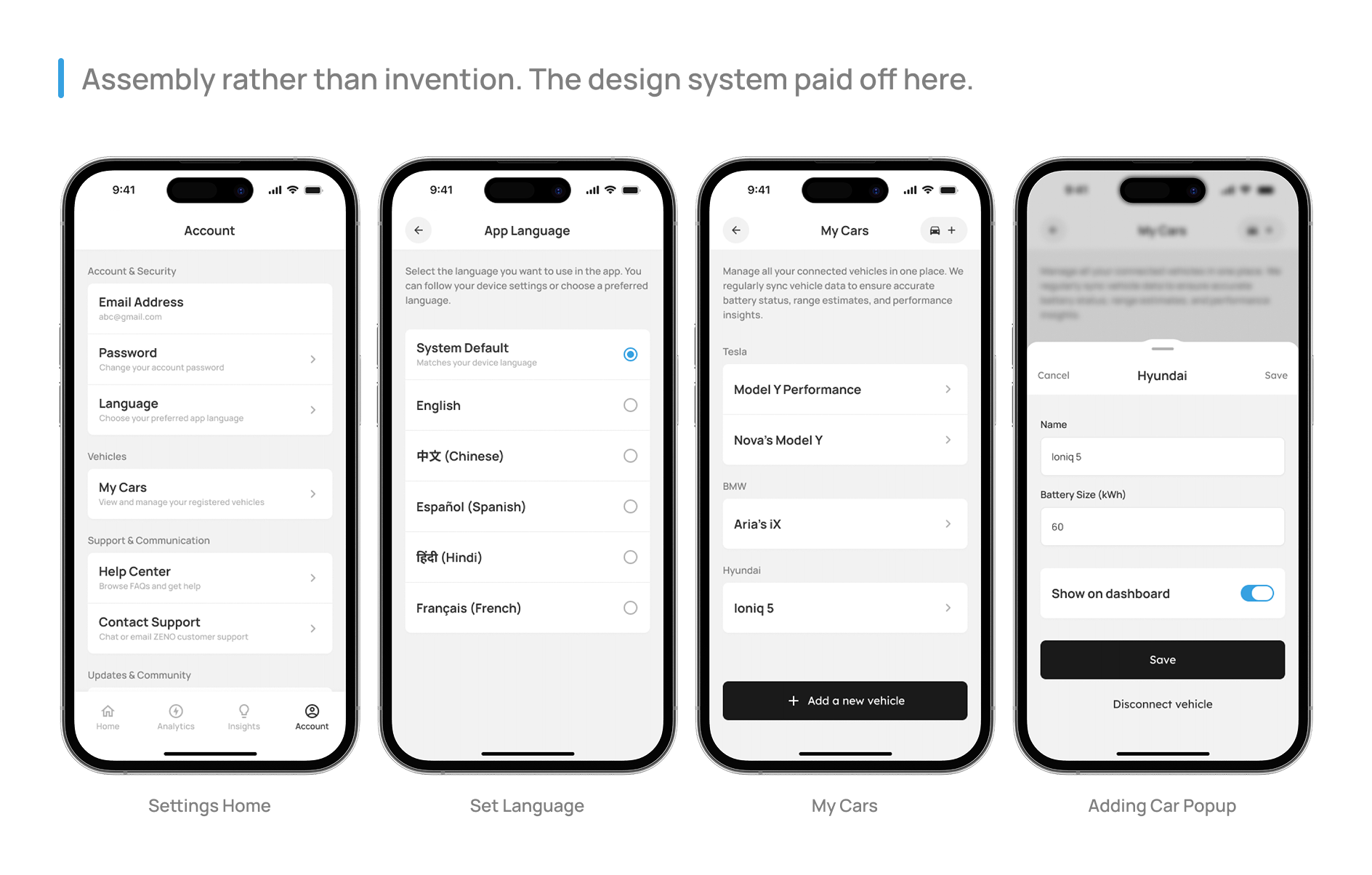
Settings

Reflection

Build the design system first

Manual component updates across 35+ screens for months. Design tokens and component libraries should be day one, not an afterthought.

Test with real users earlier

Decisions debated for days became obvious the first time a real user touched the screen.

Document decisions as they happen

One sentence per key decision, written at the time, would have made this case study significantly more accurate.

Perspective

“Simplicity is not the absence of complexity. It is evidence that someone worked very hard to hide it in exactly the right places.”

Ritam Biswas

"Designing with clarity, minimalism, and purpose"

Copyright © 2026 Ritam Biswas. All rights reserved.